Vesta Redesign Objective, phase 3: the app you open every day
Third step out of five: warm palette, reworked dashboard and Create, stacked flashcards, tick credits and print details. Here is what changed on screen.
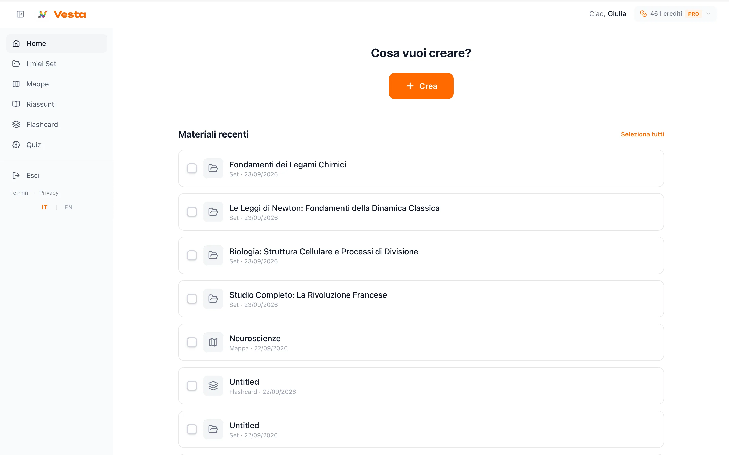
Since October we have been updating Vesta in stages, with a clear plan: the Vesta Redesign Objective, five phases through the end of 2026. The first two shipped study maps, export and the generation flow (see the 11 October changelog). Phase 3 is live today: what you open every morning, dashboard, sidebar, Create and the components you use for sets, flashcards and credits.
Below you get the real components, the same ones running in the app: you can interact (the flashcard flips, checkboxes and the grade control respond).
Palette and type
Greys are warmer, borders less cold, Vesta orange is the same but press states and shadows are tidier. Page titles use a dedicated display face; the Vesta header mark is back to Unbounded, the wide type from launch.
 VestaVesta
Components we redesigned
Refills on 3 November
Tap the card to flip
Create inside the dashboard
Create is a page with topic, format (here a set) and target grade on one flow. Many files collapse to “+N materials” instead of filling the screen.
Topic
French Revolution, causes and effects
Target grade
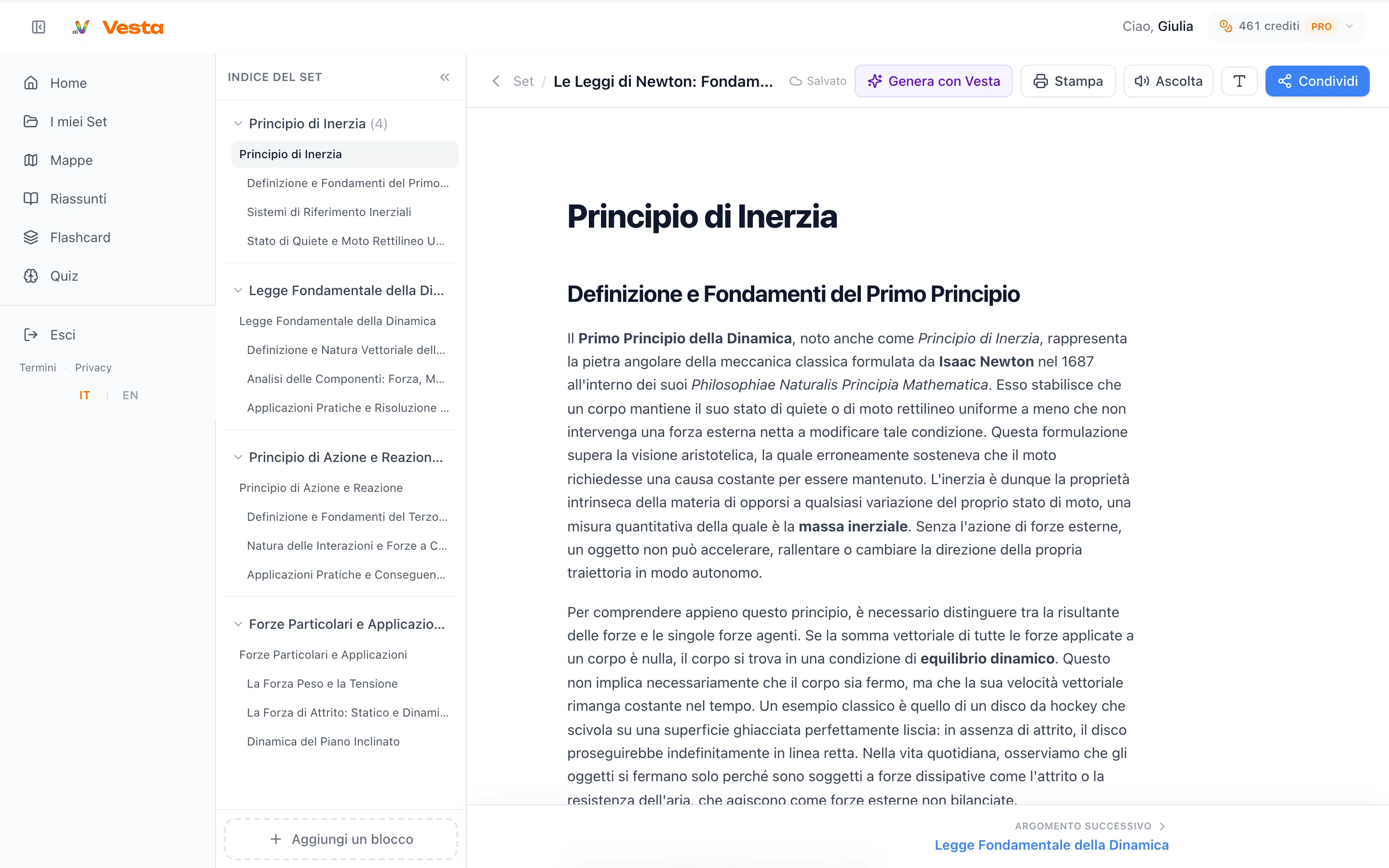
Set print and PDF
In the print menu you can leave images out if you only want text on paper. Citations and PDF tables are plainer; LaTeX in cells is more reliable.
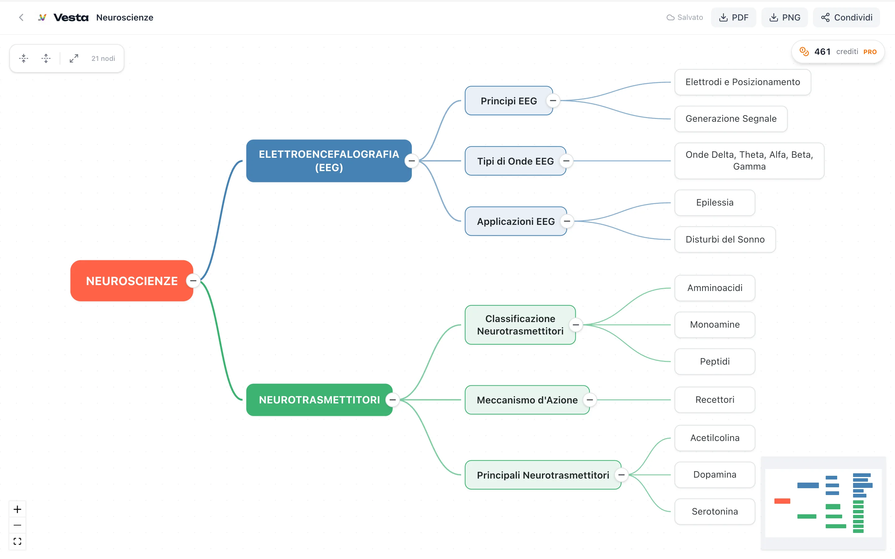
Sets and maps, meanwhile
On Pro, figures in chapters prefer Wikimedia and skip full book-page photos. A map created on its own, not inside a set, now matches the detail level of a map generated from a set.
Open studio.withvesta.it and look at the sidebar and Create: if something feels off, write from the Support chat or to [email protected].