Studying with dyslexia: reading voice and high readability
You listen to the summary out loud and change font and spacing. What is there, how to turn it on and why it helps.
VTeam VestaStudio · 18 September 2026 · 4 min read
High readability
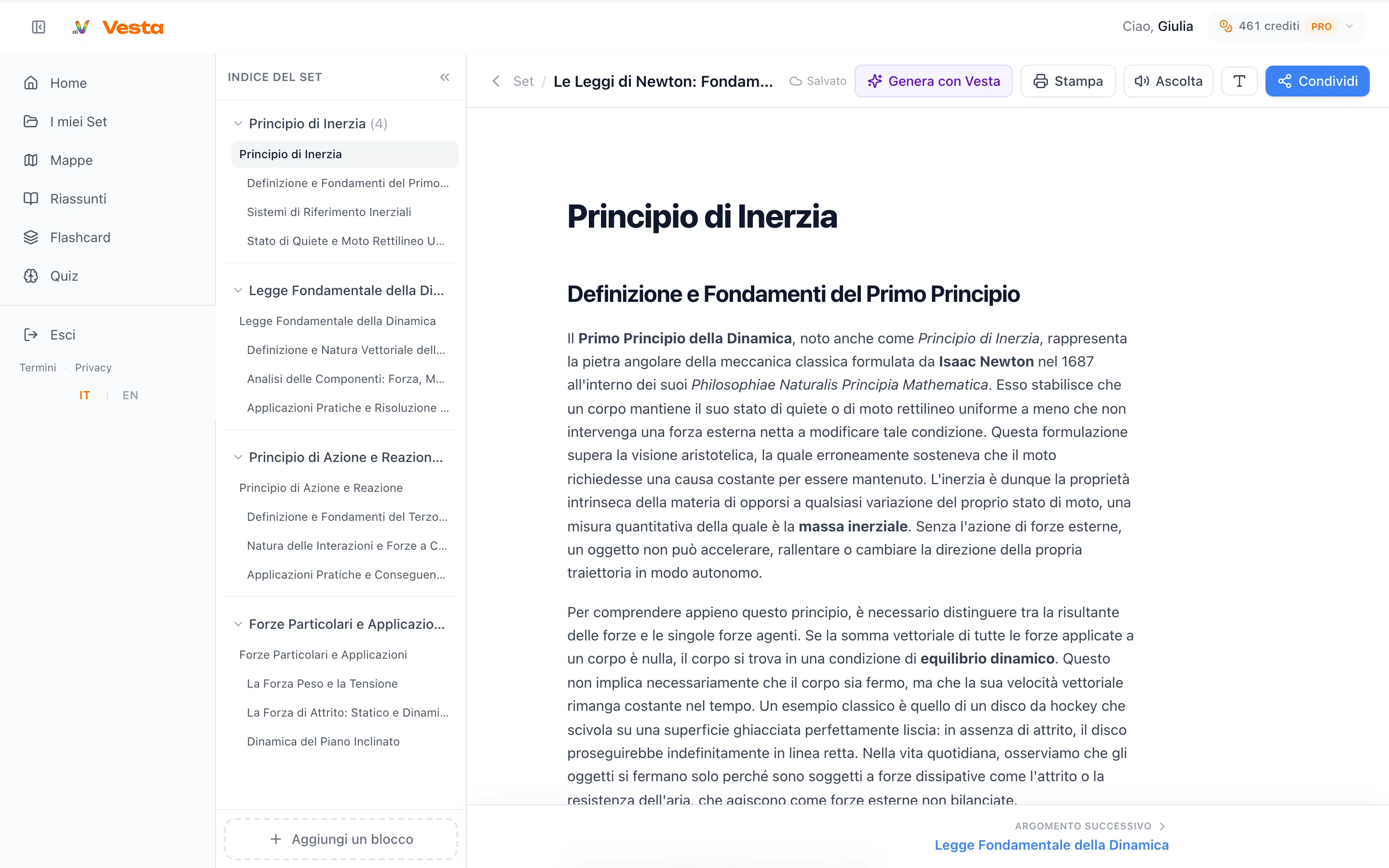
In the toolbar of a set or a summary there is the T icon. Pressing it switches the text to Nunito, a rounded typeface in which letters such as b and d, l and I are easy to tell apart, with wider spacing. Menus and buttons stay the same and the choice stays on for that device.
Listen
With the Pro plan a natural voice reads sets and summaries. You can review while you move around, without looking at the screen.
They work better together
Reading in the clearer typeface and listening to the same text lowers the effort of the first readings. Then flashcards and the quiz make you recall the information without rereading everything.